Getting Started
Why Are My Watercolors Muddy? Find the Cause Before Adding Paint
A dull green and a damaged wash may look equally disappointing, but they need different fixes. Start with a clean swatch and one small comparison.
By Hobby-ist Editorial Team · 4 min read · October 19, 2026
In this story
When a watercolor looks muddy, stop adding paint for a moment. First decide what “muddy” describes: a mixture duller than expected, a surface damaged by repeated brushing, or a picture with so little light-dark contrast that everything merges. Those can look similarly disappointing on the page, but buying a brighter tube will not solve all three.
A useful first move is a small clean swatch beside the painting. If the same two paints make a pleasing color there, the tubes may not be the main problem. If the clean mixture is still muted, investigate the color combination before blaming your brushwork. This is a troubleshooting sequence, not a claim that every muted color is a mistake.
A clean brush can still make a quiet green
Color names are broad promises. Two paints called blue can lean toward different neighboring colors, and a yellow can do the same. Winsor & Newton’s color-bias guide explains why those tendencies affect mixtures. Adding a complementary component can neutralize a mixture you expected to stay bright. “Blue plus yellow” is a starting description, not a guarantee of one particular green.
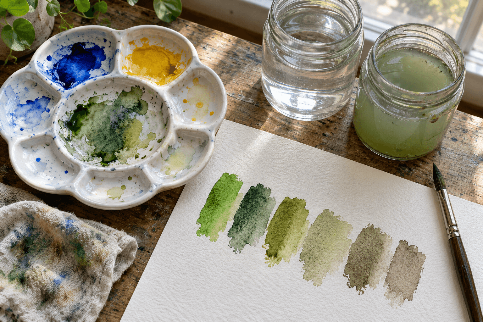
Use the paints already on your table. On scrap watercolor paper, place each color alone, then mix a small amount of the two in a clean well. Make another sample with more of the first color and another with more of the second. Let them dry before deciding which one matches your intention. The comparison is more useful when it has a purpose: a bright leaf, a distant hillside or a shadow may need different greens.
If you own alternatives, change just one paint for the next row. Winsor & Newton’s three- and six-color mixing guidance offers context for why a split selection can expand mixing options. You do not need to buy a full set to discover that two existing blues behave differently.
Separate an unwanted ingredient from an unwanted result
Before making the next swatch, clean the mixing area and brush and use fresh water. Our suggested two-jar setup gives the first jar the dirty rinse and reserves the second for a final rinse. It is not a magical rule, and both jars eventually need changing. It simply makes it easier to notice when yesterday’s brown is joining today’s yellow.
Keep a small clean area of palette for the mixture you care about. If you dip into several wells while undecided, you may lose track of what is in the puddle. Start another small puddle rather than endlessly correcting the first. The abandoned mixture may still be useful elsewhere, but you no longer have to force it into the color you imagined.
Has the paper become the problem?
If the mixture looks good on the test strip but dull and ragged on the painting, look at the surface and the number of passes. Trying to fix a damp area over and over can create a different problem from mixing the wrong pair of pigments. Let the area dry and judge it before another intervention. Not every passage can be returned to fresh white paper.
Lifting behavior varies with paint and paper; the manufacturer’s lifting guide is a reminder to test a correction on scrap first. We would not prescribe aggressive scrubbing as a universal rescue. Sometimes leaving an imperfect section alone protects the rest of the image.
Our watercolor paper buckling guide addresses another paper problem that can distract from the paint itself. A wavy sheet and a neutralized mixture are separate issues even when they happen in the same session.
Dull is not always wrong
Look at the whole picture from a little farther away. Does it need cleaner color, or does it need a light area left light and a dark area committed to being dark? A muted passage beside a clear accent may look intentional; the same passage repeated everywhere may feel lifeless. That is a composition judgment, not a reason to ban brown or gray from the palette.
If you want to rebuild confidence without rescuing a whole painting, our small watercolor patches offer a lower-stakes return. Make a few mixtures for their own sake and let the page tell you something before it has to become a picture.
Hobby-ist’s order of operations is simple: compare a clean mixture, inspect the working surface, then judge the image’s contrast. Change one thing you can name. A clearer diagnosis is usually worth more than one more layer of paint.
Sources & verification
Information checked: 2026-10-19